

Appearance
Style the hosted sign-in pages (page, sign-in card, colors, and text) and preview the result live before you save.
Appearance settings control the look and feel your users encounter on the hosted sign-in pages, the multi-factor prompts, the consent screen, and the end-user portal. A consistent color scheme, font, and layout make the experience feel like part of your own service. The theme and accent color also carry into the system emails the platform sends.
The editor is split into two areas:
- Left: every setting, grouped top-down under Page, Sign-in card, Colors, Text, and Card frame, so you can work from the page structure down to the finishing touches. Each row shows its current value; select a row to open a small panel with the control (a color picker, an option list, or a text field).
- Right: a live preview of your real sign-in page that updates as you change a setting, so you see the result before saving. Use the light/dark toggle inside the preview to check both theme variants, and the address bar to switch the previewed screen (sign-in or password reset).
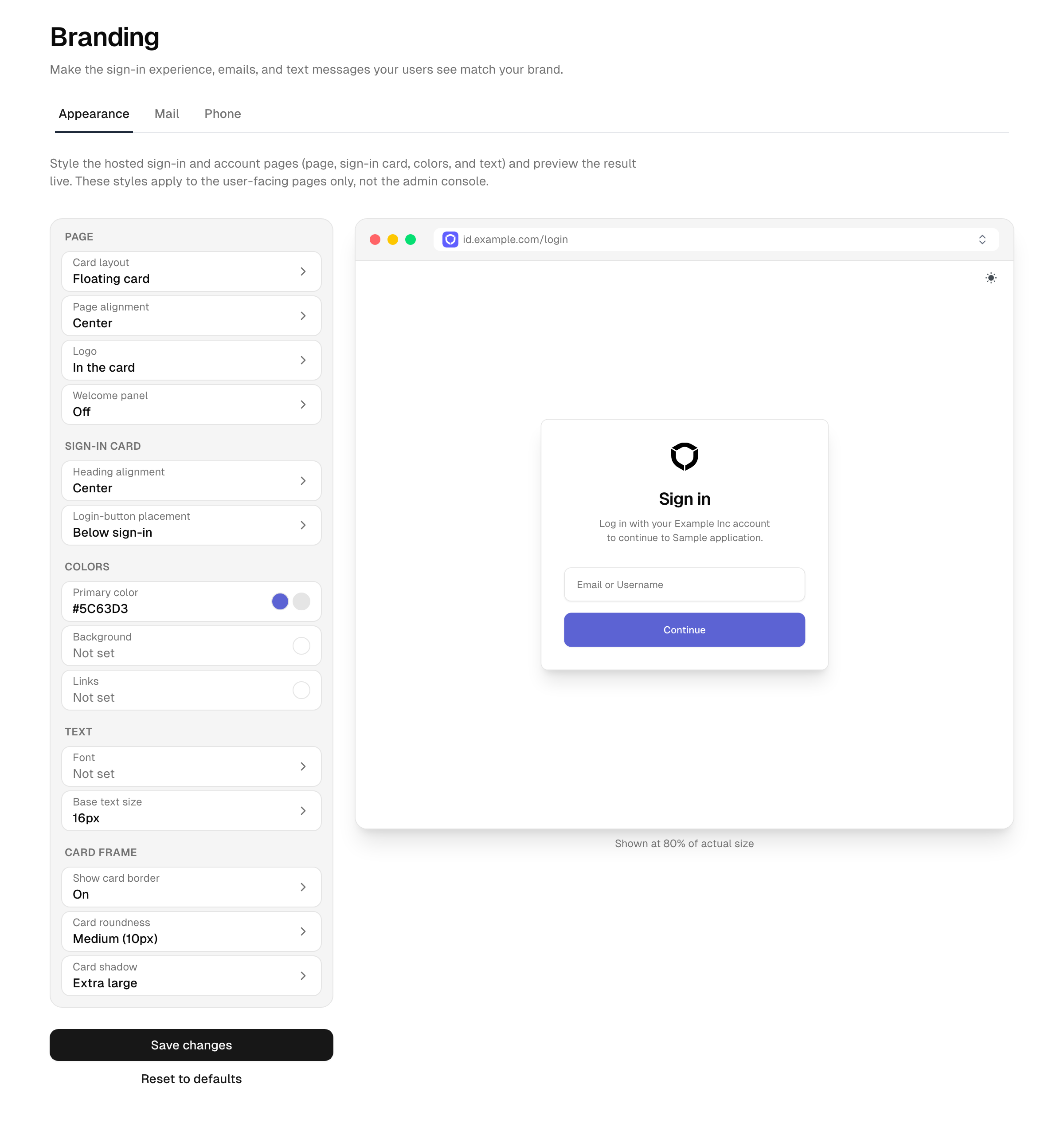
Configure appearance
- In the Admin Console, open Branding → Appearance.
- Select a setting on the left and adjust its value. The preview on the right reflects each change immediately.
- Use the light/dark toggle inside the preview to check both theme variants.
- Select Save changes. Updates apply the next time a user loads a branded page.
To start over, select Reset to defaults below the save button and confirm. This returns every appearance setting to its default.
Tip: The live preview shows unsaved changes. To confirm the saved result on the real page, open your sign-in page in a private browser window, since your console may already be using a cached theme.
Page
- Card layout: Floating card (default) shows the sign-in form as a card on the page. Side panel docks it as a full-height panel to the left or right edge; the rest of the page shows the background color or image. In panel mode the border and shadow apply to the panel's inner edge, and the welcome panel is not available.
- Page alignment: positions the sign-in card to the left, center, or right of the page. With the side-panel layout it picks the docked side (left or right).
- Logo: where and how the logo renders. The logo image itself (light and dark variant) and the favicon are set under Settings → General.
- Placement: In the card shows the logo inside the sign-in card above the heading. On the page shows it outside the card: centered above the card, or in the top page corner when the position is left or right. Hidden removes it.
- Position: aligns the logo left, center, or right within its placement. With the side-panel layout and placement on the page, the position is ignored: the logo always sits in the top corner opposite the panel.
- Size: the logo height in pixels.
- Show welcome panel: turns the welcome panel (an image shown beside the sign-in form on wider screens) on or off. It appears only on the first sign-in step, not on the password or multi-factor steps. It is off by default; the two welcome-image settings below apply only when it is on. Not available in the side-panel layout.
- Welcome image URL: the image shown in the welcome panel.
- Welcome image side: whether the welcome panel sits on the left or right of the form.
Sign-in card
- Heading alignment: aligns the heading and description of each sign-in step left, center, or right.
- Login-button placement: shows the social and enterprise login buttons above or below the sign-in form. The divider stays between the form and the buttons.
Colors
- Primary color: the accent applied to buttons, links, and highlighted controls. Pick a color from the swatch or type a hex value such as
#0F1010. - Primary color (dark mode): an optional accent used when the page renders in dark mode. Leave it empty to reuse the primary color.
- Background color: the page background behind the sign-in card, with an optional full-page background image. Leave both empty to use the theme default.
- Link color: the color of text links. Leave it empty to inherit the primary color.
Text
- Font family: the CSS font family applied to the sign-in pages, for example
Inter, system-ui, sans-serif. - Webfont stylesheet: an optional link to a webfont stylesheet (for example Google Fonts) that provides the font named above. Leave it empty to use the default font.
- Base text size: scales all text on the sign-in pages together, from 12 to 20 pixels (16 by default).
- Link style: whether text links appear normal or underlined.
Card frame
These settings frame the sign-in card (the widget that holds the login form).
- Show card border: turns the card's outline on or off. In the side-panel layout the border shows only on the panel's inner edge.
- Card roundness: the overall roundness of the interface, from none to extra large. It applies to the sign-in card and to buttons, inputs, and other controls, so the whole page shares one consistent radius.
- Card shadow: the depth of the drop shadow behind the card, from none to extra large. In the side-panel layout the shadow is cast toward the open side of the page.
Where the rest of your branding lives
The brand assets (logo, dark-mode logo and favicon), the support and legal links, the languages your sign-in pages offer, and the theme (light, dark, or the user's preference) are not set here; they live on Settings → General. Logo and favicon apply platform-wide, including the Admin Console, which is why they sit with the general settings; appearance only controls where the logo is placed on the sign-in pages.
Reference
| Group | Setting | Effect |
|---|---|---|
| Page | Card layout | Floating card or full-height side panel |
| Page | Page alignment | Card aligned left, center, or right; panel docked left or right |
| Page | Logo | Placement (widget, page, hidden), position, size |
| Page | Show welcome panel | Side welcome panel on or off (off by default, card layout only) |
| Page | Welcome image URL | Image shown in the welcome panel |
| Page | Welcome image side | Welcome panel on the left or right |
| Sign-in card | Heading alignment | Heading and description aligned left, center, or right |
| Sign-in card | Login-button placement | Login buttons above or below the sign-in form |
| Colors | Primary color | Accent for buttons, links, and highlights |
| Colors | Primary color (dark mode) | Accent used in dark mode (falls back to primary) |
| Colors | Background | Page background color and optional full-page image |
| Colors | Link color | Color of text links (falls back to primary) |
| Text | Font family | CSS font family for the sign-in pages |
| Text | Webfont stylesheet | Webfont stylesheet providing the font |
| Text | Base text size | Scales all sign-in page text (12 to 20 px) |
| Text | Link style | Links normal or underlined |
| Card frame | Show card border | Card outline; panel layout: inner edge only |
| Card frame | Card roundness | Roundness of the card, buttons, and inputs (one global radius) |
| Card frame | Card shadow | Depth of the drop shadow; panel layout: cast toward the open side |
Troubleshooting
- A custom font does not load. Confirm the Webfont stylesheet points to a valid webfont stylesheet served over HTTPS, and that the Font family name matches the family that stylesheet defines.
- The preview looks right but the real page does not change. The preview shows unsaved edits. Select Save changes, then reload the sign-in page in a fresh browser session.
See also
- Settings → General: logo, legal links, and enabled languages
- Email: the theme and accent carry into system emails